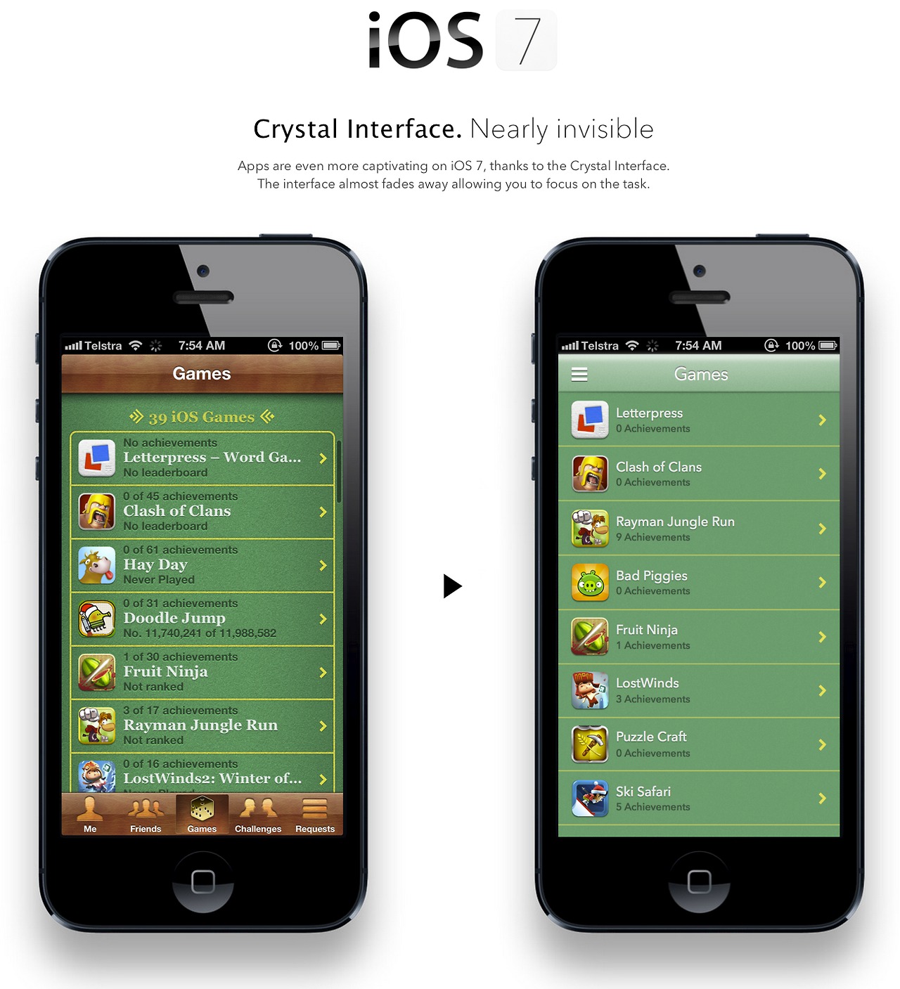
Extrem de multi posesori de iDevice-uri asteapta ca in iOS 7 Jony Ive sa-si puna amprenta de sef al echipei de design, iar unele concepte prezentate acum ar putea deveni realitate. Deocamdata un designer s-a gandit ca Game Center-ul are nevoie de o schimbare majora si s-a gandit sa prezinte o posibila modificare a aplicatiei native din iOS. Ideea sa a fost de a simplifica interfata aglomerata a actualei aplicatii si de a pune accentul pe informatiile necesare, oferind optiunea de a accesa restui sectiunilor printr-o lista drop-down.
I believe the game center app would benefit by changing to a slide out nav instead of the tab bar. The reason for this is that “Me tab” and “Friend requests tab” have a lower frequency of use, unlike in say the app store app where you move between featured, updates, top charts and search frequently when using the app, so in that case the tab bar makes sense. I have also looked at placing more focus on achievements for different games. I am not sure that knowing that you are no. 11,740,241 of 11,988,582 is a necessary stat at this list view level and also creates extra noise.


