Logo-urile corporatiilor raman adesea alaturi de firmele acestora de-a lungul multor epoci de la productie. De-a lungul timpului, semnificatia simbolului de la inceputurile sale se pierde.
Unele companii dau logo-urilor lor sensuri duble abia-vizibile pentru a ne incuraja sa ne uitam mai atent la ele, crescand recunoasterea brand-ului. Altii o fac ca un tribut pentru orasul lor natal, pentru a ne influenta subconstientul, sau pur și simplu pentru distractie.
Este posibil sa fi observat caracteristicile ascunse ale unor logo-uri in trecut asa ca am adunat 22 dintre cele mai surprinzatoare ce contin mesaje subliminale.
Beats — The “b” in the beats logo is mean to look like someone wearing headphones.
Pinterest — The social media site allows users to pin images they found onto the web onto a blank canvas. Notice the pin hidden in the “P.”
FedEx — The FedEx logo hides an arrow in its negative space, to imply efficiency and forward motion.
Gillete — Look closely at the “G” and the “i” in this logo and you’ll notice the razor-sharp cuts into the text, which represents the shaving brand’s main product.
NBC — The white space in the NBC logo creates a peacock — representing NBC’s status as a loud and proud broadcaster.
Vaio — The logo for Sony’s now-discontinued computer range represents the brand’s integration of analog and digital technology. The ‘VA’ is designed to look like an analog waveform, while the ‘IO’ is binary code.
Tostitos — The two middle ‘T’s in the Tostitos logo are people, while the dot of the eye is a pot of dip.
BMW — The German car company was established out of an aircraft manufacturing firm in 1917. Though BMW was forced to stop producing aircraft in 1918 by the Treaty of Versailles, it held onto its heritage with its logo: The white quarters represent a propeller, while the blue sections symbolize the sky.
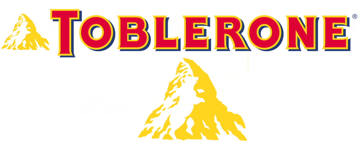
Toblerone — See the dancing bear in the mountain? The design is a tribute to the Swiss town where the chocolate was developed: Bern, known as “The City of the Bears.”
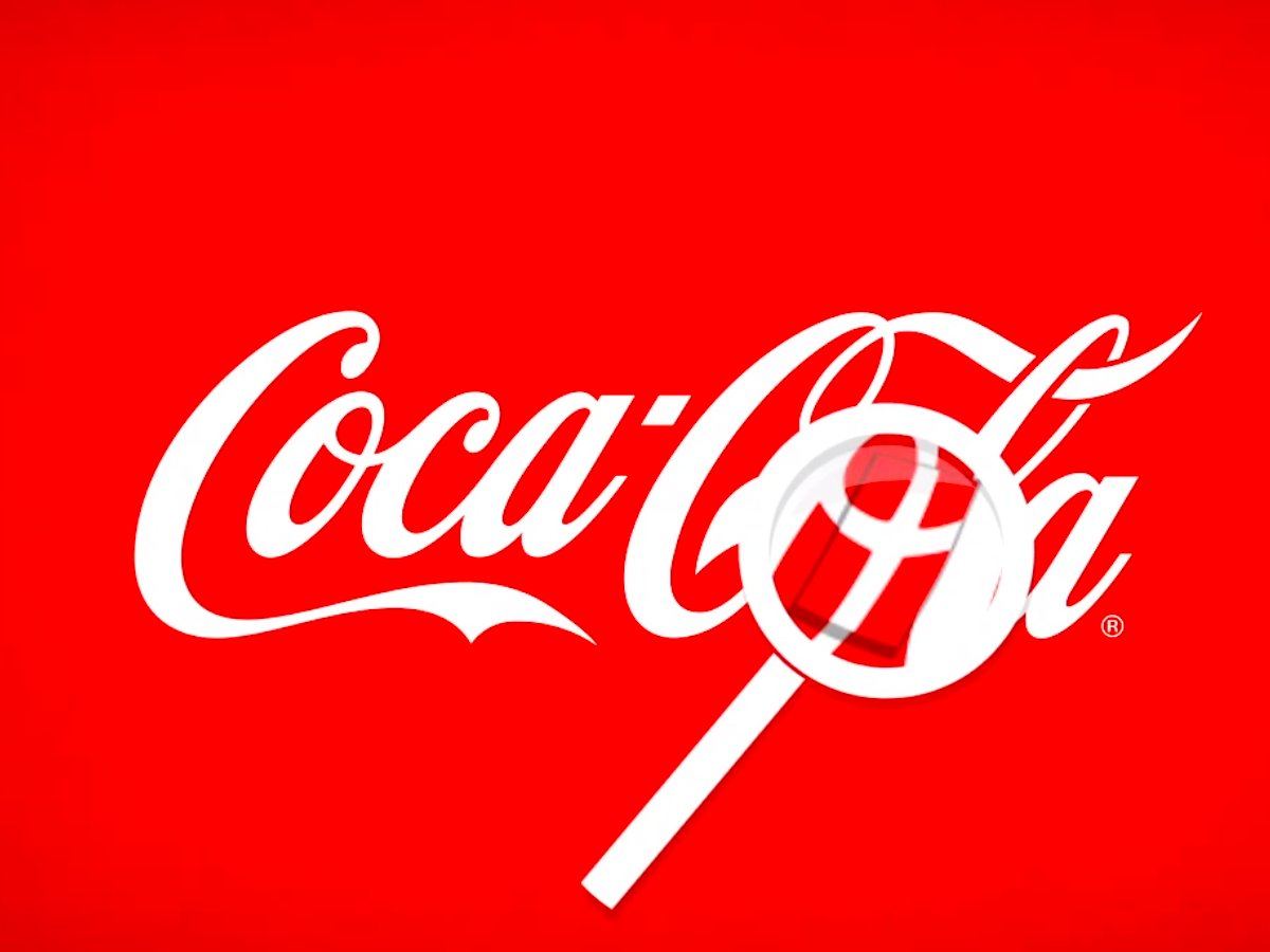
Coca-Cola — The soda brand’s 2013 campaign in Denmark points out an unintended message hidden within its logo. The Danish flag can be found nestling between the ‘O’ and the ‘L.’
Amazon — The arrow in the Amazon logo points from A to Z, referring to all that is available on Amazon.com, and it doubles as a satisfied smile (with a dimple.)
LSO — The London Symphony Orchestra logo is not only an acronym, but also looks like an abstract conductor.
LG — The electronics company managed to create a winky face out of ‘L’ and ‘G”.
Tour de France — The sun in the Tour de France logo is also a bike wheel.
Shelter — British charity Shelter wants to find homes for the homeless, which is why they made their “H” look like a house.
Cisco — The IT company uses lines to represent electromagnetic waves, as well as the city’s famous Golden Gate Bridge.
Milwaukee Brewers — It’s easy to miss the second meaning of this throwback logo from the baseball team. The mitt is obvious, but the built-in letters usually elude the viewer.
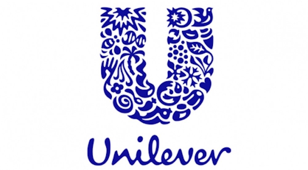
Unilever — The giant “U” in the Unilever logo is made up of icons which represent different aspects of the company’s business. The swirl represents a “passion for great flavors and taste,” for example.
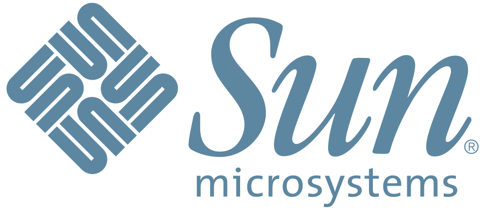
Sun Microsystems — Before it was bought by Oracle, Sun was a major computer manufacturer. Its logo is a perfect anagram; it can be read from any direction. (Note also that the graphic doesn’t actually include an S.)
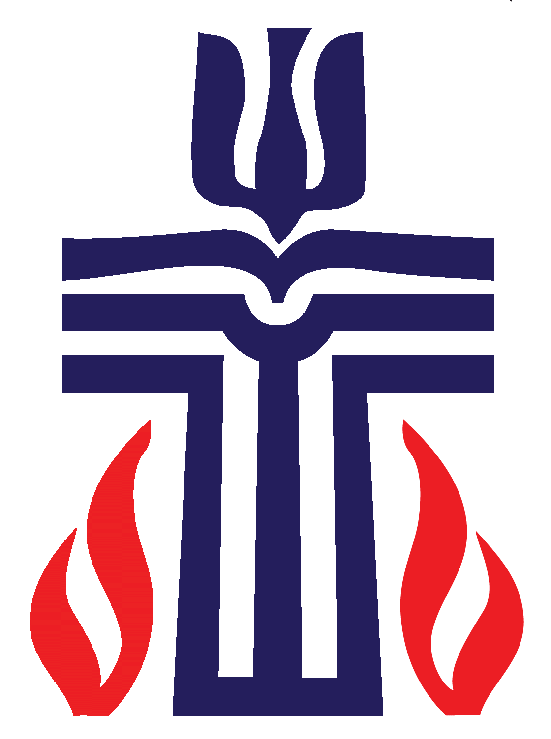
Presbyterian Church — This church’s logo is brimming with symbolism. There are eight different religious symbols buried in the main image.
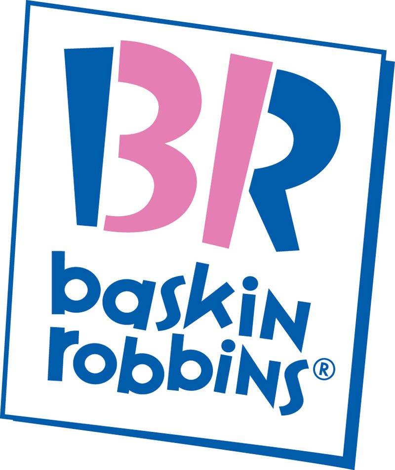
Baskin Robbins — This logo, introduced in 2005, cleverly uses the company’s initials to advertise its number of ice cream flavors (31.)
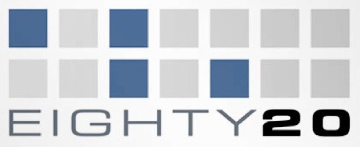
Eighty20 — This market data research company incorporated the binary code spelling of its name. Using blue squares as ones and gray squares as zeros, 1010000 (80) is the top line, while 0010100 (20) is the bottom.


